LEARN & EARN
Learn. Earn. Invest.

At a glance
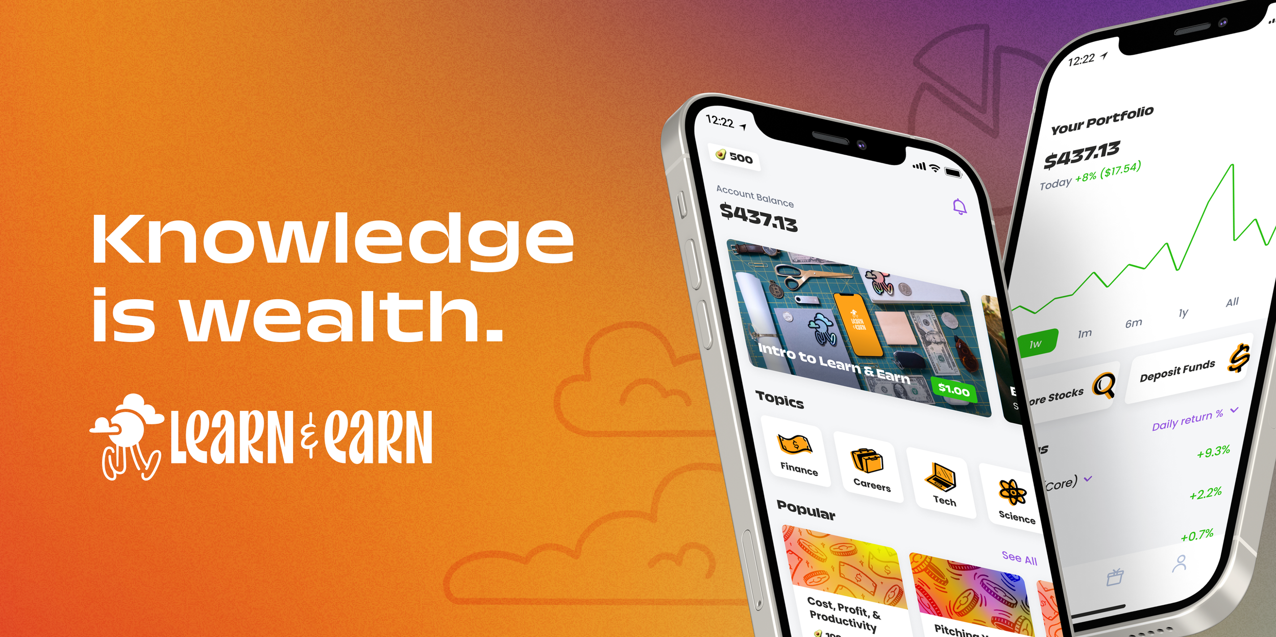
Learn & Earn teaches financial literacy, work readiness, entrepreneurship, and more through bite-sized courses. Users can take courses and earn rewards that can be invested into the real stock market through ETFs and fractional shares.
My Role
As an Associate/Senior Product & Visual Designer, I contributed my skills in UI/UX, Product Design, Illustration, and Visual Design.
TEAM
Kevin Ulloa (Head of Design)
TOOLS
Figma, Procreate, Adobe Illustrator
THE CORE EXPERIENCE
Learning & earning with courses
The app’s primary function is to help users earn money through short, educational courses on a variety of topics. Courses are accessible from the home screen with easy access to different topics and popular lessons. Users can earn real money or points that can be redeemed for money to kickstart their investment portfolios.
I helped improve the course experience by creating new course art, curating photos for featured courses, and working on the development of Context Cards (purple screen shown below) to make courses more robust and educational.

Investing earnings in the stock market
Users are encouraged to keep their earnings in their investment portfolio to watch their wealth grow. Using robo-advisor technology, the Learn & Earn portfolio eases users into investing by providing them with low-risk stock options and ETFs. This diversified portfolio aims to help users learn more about investing and the stock market without overwhelming them.

ILLUSTRATION
Icons & Course Art
The product’s icons and illustrations were my first major contribution to Learn & Earn. I iterated and designed icons for each of the course topics in a simple, color-blocked style.
I continued with the same illustration style to make a series of collages that corresponded to the contents of each topic. They were then overlayed onto color-coded gradients that further defined the separate categories. The course art and gradients are randomly generated within each topic when a new course card is created.


Animated GIFs
I also created some fun animated modals for the app to alert users about things like enabling notifications and linking their bank accounts.
ADDITIONAL FLOWS
Onboarding tour
During my time at Learn & Earn, I redesigned the app’s tour. Users see this explainer flow upon app launch to introduce them to its basic functions.
This tour features background illustrations that I created for the brand. A lot of my contributions to Learn & Earn included illustration work like this that helped make their brand presence stronger and more cohesive.

Account Strength
Some of the product work I contributed to included the Account Strength feature, which guided users to complete a short list of tasks that would teach them the basic mechanics of the app and how they could gain the most value from its features. Account Strength helped lift metrics and encourage longer-term use of the app by motivating users to make deposits into their investment accounts.
Rewards
I also helped with the build and launch of the Rewards feature. This feature allowed users to earn rewards to further fund their investment portfolios by engaging with our brand partners. The portal provided relevant offers from partners to help users further their learning with categories relating to education and financial literacy.
VISUAL DESIGN
Marketing materials
After redesigning the brand’s illustrations, I used them in various marketing materials. I updated the Invite Link graphic that generates when users share the app through messages or other platforms. I also worked on some social media posts, including the hand-lettered illustration of the company’s tagline.


Logo animation
For the conclusion of an explainer video, I created a simple logo animation featuring the brand mascot, Otis. This was my first time experimenting with frame-by-frame animation using Procreate, a digital drawing software.

REFLECTION
Key Takeaways
While working at Learn & Earn, I got my first taste of product design in a professional and corporate setting. I had the opportunity to work in a small team comprised of the VP of Product and Head of Design which helped me grow in both design and product spaces. I got to brainstorm and develop new product features in a supportive environment. I also gained experience working with and contributing to the Learn & Earn design system.
Highlights
Some of my illustration projects are accomplishments I’m proudest of when it comes to the work I did with Learn & Earn. Redesigning the entire illustration library and creating new course art for the app was a great opportunity for me as a designer and illustrator newly in a commercial setting.
